Colour Temperature – Warm White or Cool White? A Guide for Interior Designers and Homeowners
Lighting is one of the most powerful tools in interior design. Beyond functionality, it influences mood, shapes space, and highlights textures, colours, and architectural features. One key but often overlooked element is colour temperature—the subtle difference between a space feeling inviting and cosy, or sterile and unwelcoming.
Whether you’re a homeowner selecting lights for a renovation or an interior designer creating cohesive visual narratives across rooms, understanding the difference between warm white and cool white lighting is essential to creating intentional, well-balanced interiors.
What is Colour Temperature?
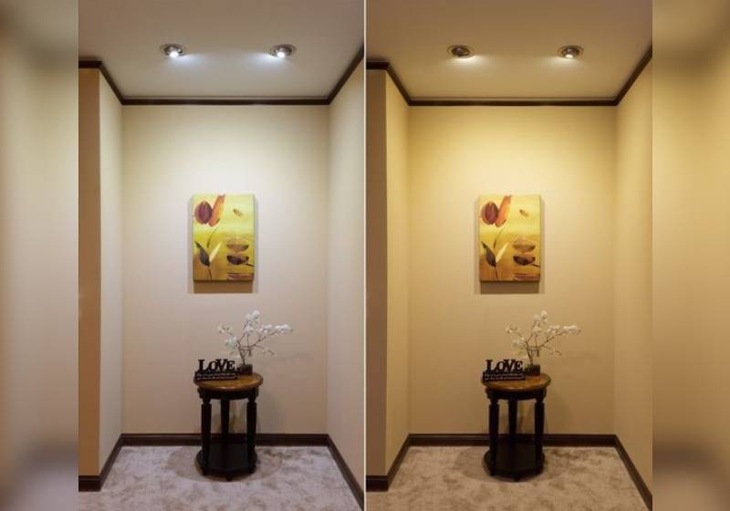
Colour temperature refers to the visual “warmth” or “coolness” of light, measured in Kelvin (K). The lower the number, the warmer (more yellow/red) the light appears; the higher the number, the cooler (bluer) it becomes.
Here’s a quick breakdown:
- Warm White (2700K – 3000K): Soft, yellowish light that mimics traditional incandescent bulbs and candlelight.
- Neutral/Cool White (4000K – 5000K): Clean, bright, and slightly bluish – similar to daylight or fluorescent lighting.
- Daylight (5000K – 6500K): Very white or even blue-toned light, often used in task-heavy environments.
For residential interiors, the decision generally comes down to warm white vs cool white. Choosing the right temperature dramatically influences how colours appear and how people feel in a space.
The Emotional Impact of Light
Before getting into room-by-room recommendations, it’s helpful to understand how colour temperature affects human psychology.
- Warm White: Invokes a sense of comfort, relaxation, and familiarity. It tends to be more flattering on skin tones and reduces visual harshness—ideal for rooms meant for rest and connection.
- Cool White: Promotes alertness, clarity, and focus. It enhances contrast and makes a room feel clean and modern. Cool light is energising, which is why it’s often used in task lighting and commercial spaces.
As a designer or homeowner, your job is to use this emotional vocabulary of light to enhance the experience within each space.
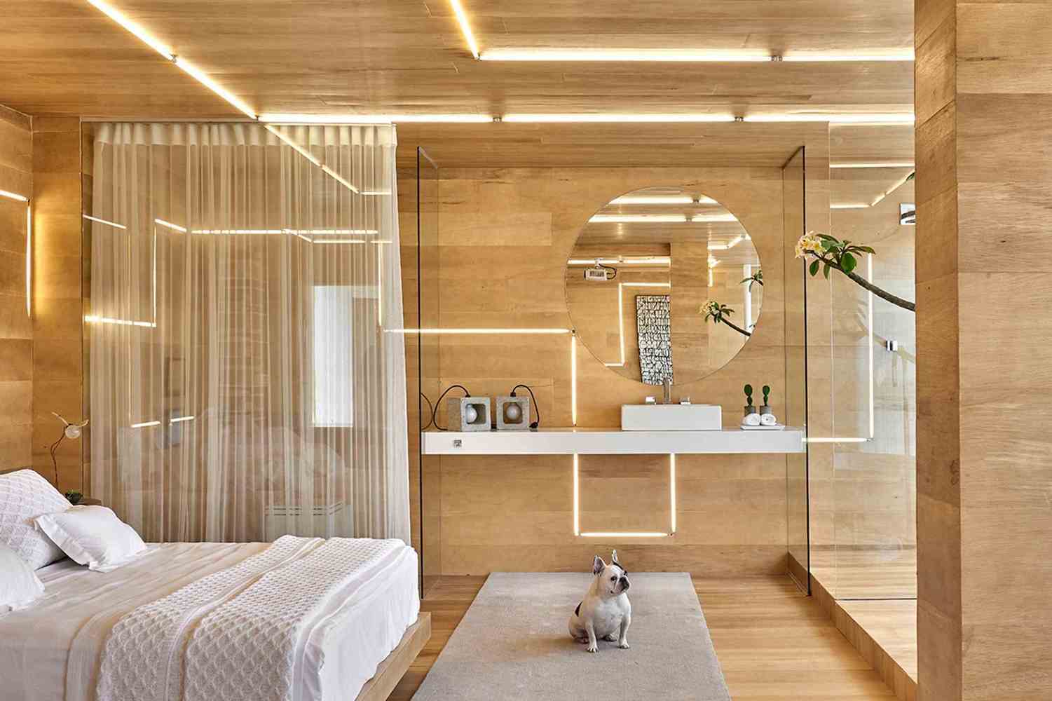
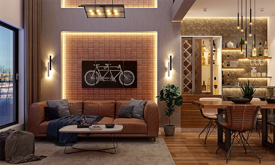
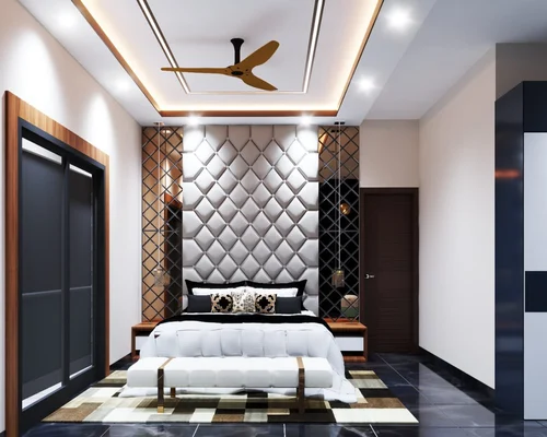
Warm White – The Atmosphere Creator
Warm white lighting brings a golden, soothing glow to interiors. It works beautifully in traditional homes, rustic styles, and any space where you want to encourage calm or intimacy.
Where to Use Warm White:
- Living Rooms: It softens the edges of furniture and encourages relaxation. Especially effective with timber floors, plush textiles, and earth-tone palettes.
- Bedrooms: Essential for promoting sleep and winding down. Warm white won’t disrupt circadian rhythms like cooler light can.
- Dining Rooms: Enhances mood, adds warmth to food presentation, and makes the space feel more social and inviting.
Design Pairings:
- Complements warm-toned materials like brass, timber, terracotta, sandstone, and red-toned upholstery.
- Works well with ambient and accent lighting (think wall sconces, pendant lights with fabric shades, or table lamps).
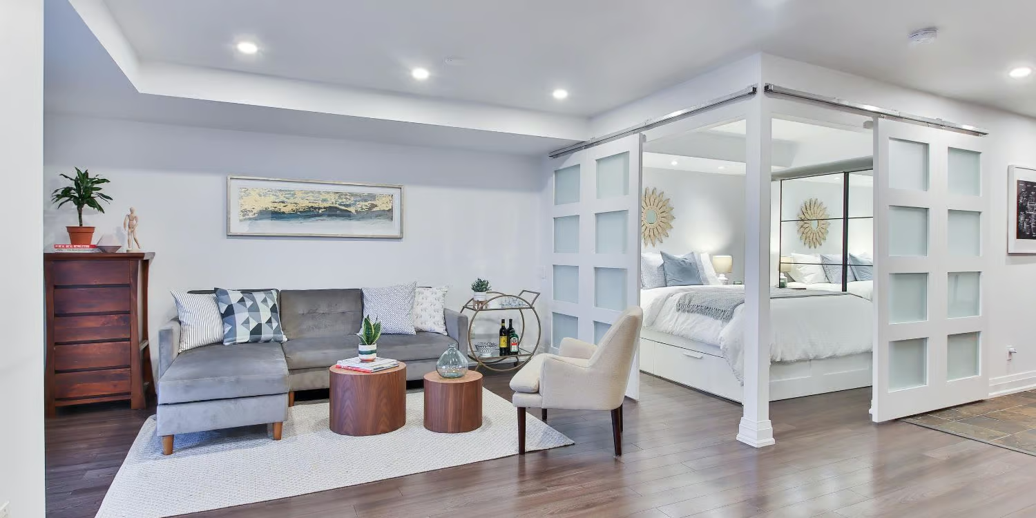
Cool White – The Modern Enhancer
Cool white lighting is crisp and clean, perfect for contemporary interiors or spaces that demand high visibility. It’s often associated with minimalism and sharp, architectural detail.
Where to Use Cool White:
- Kitchens: Clarity is critical when prepping food or cooking. Cool light ensures better visibility on countertops and stovetops.
- Bathrooms: Ideal for shaving, makeup, and grooming. It reflects true skin tones and helps avoid shadows.
- Home Offices and Studios: Stimulates productivity and alertness. Cool white mimics daylight, making it suitable for concentrated tasks.
Design Pairings:
- Pairs with cooler materials like marble, chrome, stainless steel, white walls, and monochromatic palettes.
- Complements modern design styles: Scandinavian, industrial, coastal, and high-gloss finishes.
Room-by-Room Recommendations
| Room | Recommended Colour Temperature | Why |
|---|---|---|
| Living Room | Warm White (2700K–3000K) | Creates ambience and encourages social interaction |
| Bedroom | Warm White (2700K–3000K) | Promotes relaxation and sleep |
| Kitchen | Cool White (4000K–5000K) | Improves visibility and enhances contrast |
| Bathroom | Cool White (4000K–5000K) | Provides clarity for grooming and hygiene tasks |
| Study/Home Office | Cool White (4000K–5000K) | Increases focus and energy |
| Hallways/Entrances | Either, depending on design intent | Balance warmth or brightness based on adjoining rooms |
| Outdoor Spaces | Warm White or Neutral | Warm for ambience, neutral for safety and visibility |
Colour Temperature and Interior Style
Choosing the right temperature isn’t just about practicality—it’s about maintaining harmony with the overall aesthetic.
Traditional, Farmhouse, or Coastal:
- Opt for warm white. These styles thrive on natural textures, soft lines, and welcoming energy.
Modern, Minimalist, or Industrial:
- Cool white works best. These styles favour clean lines, stark contrasts, and bold geometry.
Transitional or Eclectic:
- A balanced approach often works well. You might use warm white for lounges and bedrooms, with cool white in kitchens and bathrooms.
The Importance of Consistency
One mistake often made in lighting design is mixing colour temperatures within the same visual space. For example, using warm downlights and cool pendants in the same kitchen/living room combo can feel visually disjointed.
Best Practice:
- Maintain a consistent colour temperature within open-plan areas or shared sightlines.
- Use zoning (e.g., pendant lights over a bench, wall lights near a reading nook) to subtly shift mood without clashing tones.
Smart lighting systems (such as Philips Hue or LIFX) can also offer tunable white light, giving homeowners the flexibility to shift from warm to cool based on the time of day or occasion.
LEDs and the Kelvin Advantage
LEDs have made colour temperature more accessible and customisable than ever before. Unlike old incandescent bulbs, which were almost exclusively warm, today’s LEDs come with labelled Kelvin ratings right on the packaging.
For designers and homeowners, this means:
- You can plan lighting in sync with your material palette and furnishings.
- You can use different temperatures for general lighting, accent lighting, and task lighting.
- You can invest in dimmable and tunable LEDs to change mood throughout the day—warm in the evening, cool during morning routines.
Final Thoughts: Light as a Design Language
For interior designers and homeowners alike, lighting is not just a utility—it’s part of the design language of the home. Colour temperature, while subtle, can make or break the emotional tone of a room.
So, ask yourself:
- What do I want this space to feel like?
- How does the light interact with my materials, textures, and colours?
- Is the lighting supporting the function of the space?
With the right balance of warm and cool tones—and a clear understanding of colour temperature—you can elevate any interior from ordinary to exceptional.
Let light be your design ally.
Still unsure? Call Port Sparky today!
Call your Port Macquarie electrician now: 0416 501 728 or email: sparky@portsparky.com.au

